Think TAnk showcases things we have liked, things we have found interesting or just things that we think look nice from the past month! For this installment in our Think TAnk series, it's all about ‘Poster Design’!

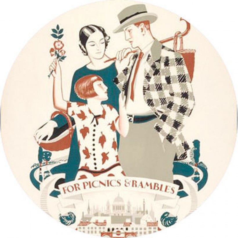
A new display of transport posters by women designers is being shown at the London Transport Museum. The display includes the first very transport poster designed by a woman back in 1910! As well as showing the amazing work of the designers, the exhibition also showcases the changes of modern London over the last 100 years. Definitely worth a visit to Covent Garden. Don't worry if you cannot make it to London, you can buy the posters here.
© For picnics and rambles from town to country, by Dora M Batty (1925)
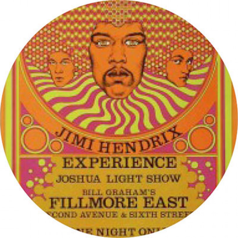
From transport to music and from London to San Francisco, I move on to an article all about the posters produced for Fillmore shows, which includes an interview with Arlene Owseichik who oversees the poster creations and has done since 1985. If you don't know about the Fillmore history, you are probably still aware of the artwork produced as the promo posters that were created for concerts at The FIllmore document the history of rock music, the ’60s and the psychedelic era, including this one designed by David Byrd (image from Wolfgang's Vault).
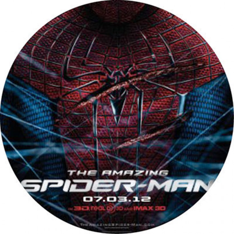
Did you know there are rules for typography in movie posters? From using Trajan in horror movies or a blue fluorescent glow for sci-fi flicks or thick bold typefaces for the strong superhero films! Luckily designers can break the rules a bit by just adding a bit of creativity, using custom fonts and thinking more about the individuality of the film rather than just the genre, bringing the viewer closer to the movies atmosphere.
However, it is not just the typography that is important in a movie poster - it also the image or elements included...have a go at this game - all you have to do is guess the film from the untitled poster.
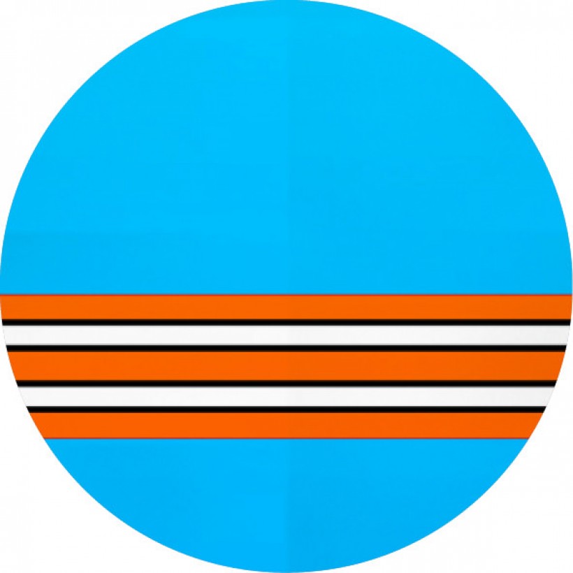
While we are on the subject of movie posters, check out these minimalist posters created using only a colour scheme to represent the movie! The artist, Tano Veron, says
The intention of this project was to explore the maximum minimalism of each poster (...) and just use color stripes.
Moving on from number 4 in my Think TAnk list, I came across this article that is against the minimal poster design trend that seems to have taken over graphic design in the past year. The argument is that minimalist posters have lost the ability to attain the focus of the subject and most designs cannot be solved without an explanation. As the author (writes,
Minimalism is about breaking something down in order to amplify its essence. But it damn well isn't about removing that essence entirely.
Can you guess what the image on the right is meant to represent? Hint...it's a TV show...(answer at the bottom of the page).

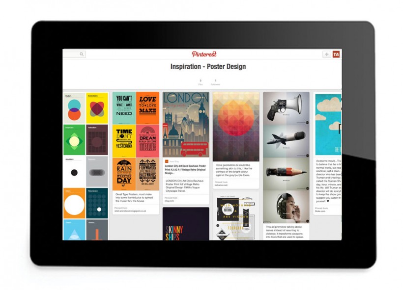
Should you wish more poster design inspiration, follow TA Design's board on Pinterest. We regularly update our boards with inspired designs including graphic design, catalogue design and typography.
See you next month for another Think TAnk blog post!
Answer: Friends