Think TAnk showcases things we have liked, things we have found interesting or just things that we think look nice from the past month!

During September we were addicted to the new IKEA printed catalogue (or should we say bookbook?) advert so this Think TAnk feature is going to be all about print!
As catalogue designers, we firmly believe in the power of print and many recent articles including this one by Parade Media Group clearly shows that "print media is highly relied upon for ideas and inspiration when shopping in key consumer product categories". As another article, Catalogues: The Persistence of Print, states
There are a lot of reasons why we continue to see print catalogues. The main one, of course, is that they’re profitable. An important one, I suspect, is that people like them because online is ephemeral and print is, relatively, permanent.
Print was and still is important, and here are 5 things that back me up!
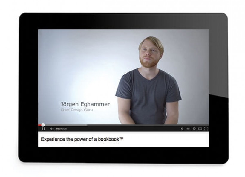
The IKEA advert that we have linked above is an excellent Apple parody and it brilliantly conveys how much power a printed catalogue has...and who are we to argue!! "Once in a while, something comes along that changes the way we live, a device so simple and intuitive, using it feels almost familiar," says Jorgen Eghammer, the "chief design guru" in the two-minute video. When I last looked, it had over 11 million views!
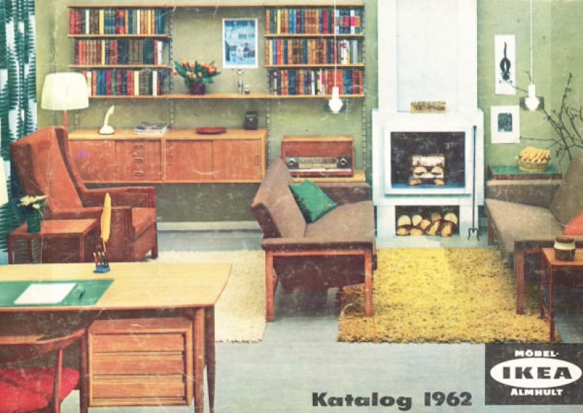
Since we are on the subject of IKEA, I should also mention this great feature that I came across via Home Designing - Every IKEA Catalogue Cover Since 1951!
It showcases the evolution of style in design both graphically and product wise. It also shows how styles can come back round and which styles have stood the test of time! I am sure I have that chair from the cover of 1967!
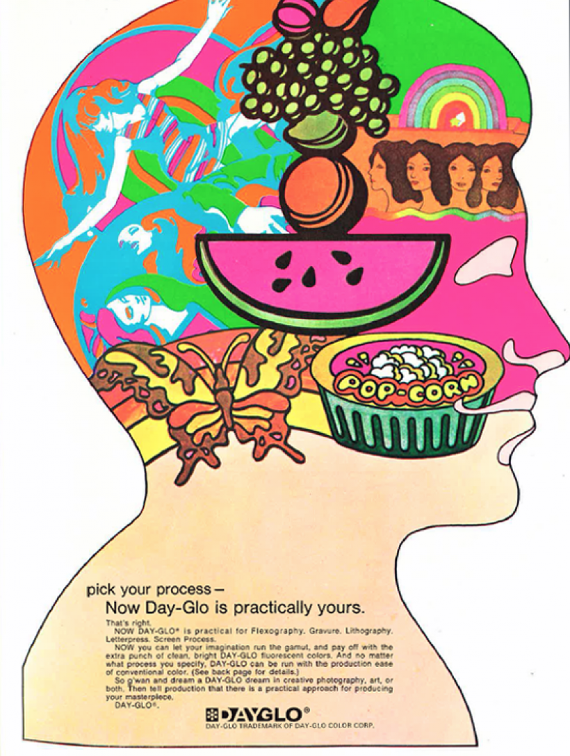
Print Mag have been busy tracking the evolution of vintage print and graphic designs ads. I stumbled across their 70's rundown which was their final installment. If you want to delve into the Print magazine archives check out the ads from the 1960's and 50's, which show the evolution from black and white ads to the emergence of colour. As the magazine says,
Viewed back to back, the visual evolution in a single decade is stunning.
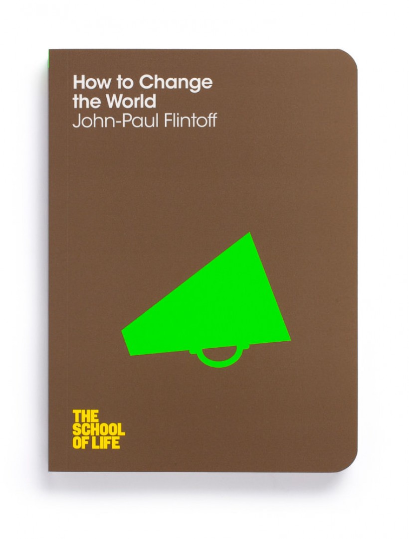
This book series is called 'Toolkit for life' and is published by Pan Macmillan and the illustrations are designed by Marcia Mihotich. We fell in love with the gorgeous simple design and bold colours.
Anything that helps us tackle some of the big issues in life - work, money, emotional maturity, digital life and changing the world has got to be worth mentioning right? Especially when the advice is housed in gorgeous books like this!
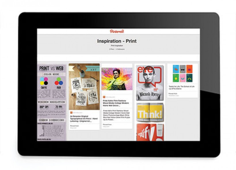
This is definitely going to be pinned on our Pinterest 'Print Inspiration' board!
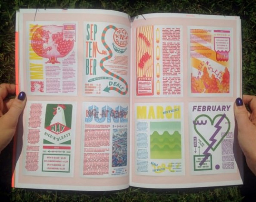
This new UK-based magazine showcases the best in print design from across the globe. This was a real treat to find via @psfk - we cannot wait to see each quarterly publication showing the
most creative and innovative printed works of design from around the world!
