1. Before you start
The Managing Director, Philip Threadgold, needed to raise his company's profile, and tell his customers and prospects about the enhanced products and service levels they now offered.
Philip wanted to work with an agency with both design and marketing skills, that would give him a valuable, fresh viewpoint across the repositioning project as a whole.
In discussion, it was clear the annual catalogue was the key communications channel and that this should include not only the products, but also the corporate positioning messages that bring out the points of difference. So the redesign was absolutely essential to the company's success.
2. Catalogue elements
2.a. Front Cover:
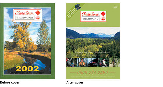
The first thing your recipient sees will they want to look further? You must set the tone, establish a need, promise a solution. Consider a tagline for your logo does everyone know what you do?
DON'T: leave any doubt. Is it a calendar? Why is 2002 so important?
DO: treat it as your shop window. Make sure your front cover says who's for and what's in it. Have a headline, preferably benefit-led.
2.b. Intro Spread:
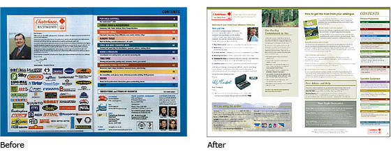
Use the intro spread to amplify the messages on the front cover. Give the reader useful information, not hard sell. Start to build a relationship, make the reader feel happy to contact you.
DON'T: splash logos and terms of business. More colours doesn't mean more sales, unless you're a paint shop.
DO: Give the reader the opportunity to find out more about what you've been changing and why, how the catalogue has changed and will help them more.
2.c. Product Spread:
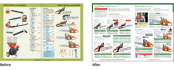
So much to do. Keep the copy with the product picture give more information - professionals want it give technical information so the reader can compare accurately have a clear navigation system using words and colours so it's easy to find your way around the catalogue include useful information bring out offers so they are clear without being garish indicate where relevant products can be found have a corporate statement in view.
DON'T: use too many colours and block capitals in the product copy.
DO: use colours consistently and sparingly to make things clearer. Use a good person/lifestyle picture, even if it's from a supplier.
2.d. Other Pages:
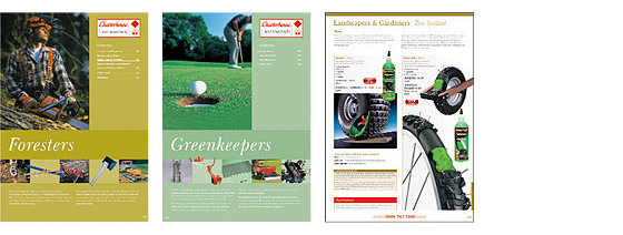
It's important to split a larger catalogue up into sections, and to have changes of pace. You can do this by using section header pages, an article on an important issue, a feature on a product, or an add for another part of your group. This all helps to keep the reader interested, especially if they're browsing.
DON'T: have every page in the same style with no variety.
DO: have a page to introduce the new section, showing the new section colour, contents and key products.
2.e. Order Form:
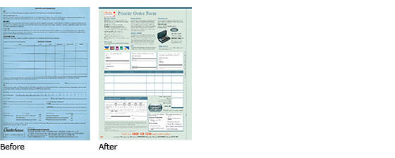
There's no excuse for this kind of thing any more.
DON'T: make your order form easier for your admin staff (make it easier for your customers!). And don't forget the DPA.
DO: use the order form to repeat the guarantee, offer an incentive, ask for an MGM name, and to let the reader ask for more information.
2.f. Back Cover:
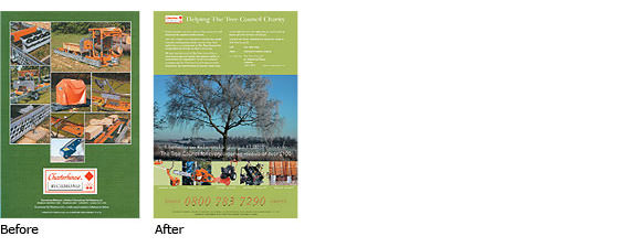
We all know there are rules. One is that the back cover is the best page for selling. But a vital part of this catalogue redesign was the marketing positioning to make Charterhouse Richmond have a personality, and stand out from the competition.
The back cover supports the Tree Council Charity, which says more about the company than 10 special offers. (There are 5 subtle key product pictures at the base, with page indicators.)
DON'T: break the rule
DO: unless you know why.
2.g. Other Pack Elements:
Remember, the surroundings of the products are just as important, if not more so, than the product pictures and copy. If your envelope or polywrap and your covering letter don't convey the right messages in the right tone, your products and offers won't ever be seen.
DON'T: assume the envelope or poly and covering letter are just to get your catalogue delivered by the Royal Mail.
DO: think of the entire pack that your prospect receives, and how it all works together to lead to an order.
3. The total picture
Any catalogue redesign is a good opportunity to communicate your new company positioning and aims to your key staff. The redesign and repositioning should be carried through to all points of communication - leaflets, adverts, PR releases and website.
4. The business result
In October 2002, Charterhouse Richmond was a very marginal part of an international group. It was not contributing to group profits, and growth was flat at best.
The new catalogue was mailed in mid-January. By April 2003, in difficult trading times for the industry sector, Charterhouse Richmond had had its best two turnover months ever, with profits at 200% compared with the same period last year.
5. The moral
A client with a clear idea of where they want to go, working as a team with an expert direct marketing copywriter and an experienced catalogue designer, can achieve really quite extraordinary business results.

