Background
GroWell supplies hydroponics equipment to the hobby and education markets. This enables people to grow plants without soil - using simply water, liquid nutrients and lights - so plants grow more efficiently.
GroWell were aware they needed to have their catalogue redesigned in order to keep the business developing dynamically.
Briefing discussions
GroWell made it clear that they wanted to raise their company profile, and appeal to a broader audience. TA Design pointed out that the existing catalogue was very jargon-filled. We also noted that the design was old fashioned and wasteful of space - all of which undercut the GroWell marketing objectives.
The Catalogue - Before and After
Front Cover
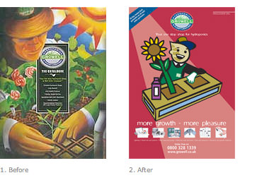
Before: first impressions of the front cover is that it is gardening in the traditional way - many likely customers won't go any further! The rather grim black panel is hardly the front cover for an enjoyable hobby. Is it a catalogue? When was it published?
After: a much simpler, stronger and arresting cover with broader appeal. We created a friendly illustration, developing an existing corporate icon. We've introduced a factual corporate tagline and an emotive, benefit headline. We've added a row of product pictures to show the range, and put some order methods to indicate that it's a catalogue. It's fun, not fuddy-duddy.
2. Intro Spread
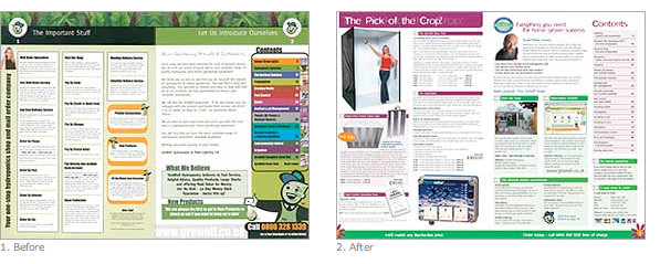
Before: another classic mistake - page 2 is a page of small print and restrictions. Why is this not at the back? The contents panel is a colour nightmare. There is no product sold on the entire spread!
After: this spread now achieves so much more. The overall look is light and not off-putting. Page 2 sells three best sellers. There is a short friendly letter giving the key benefits of ordering from GroWell, and explaining the catalogue is reorganised, with a bigger product range. The shop and the website are focused on… there is a service commitment and guarantee… the contents panel is usable without getting a migraine… and the ways to order are featured. It's fun, not intimidating.
3. Product Spread
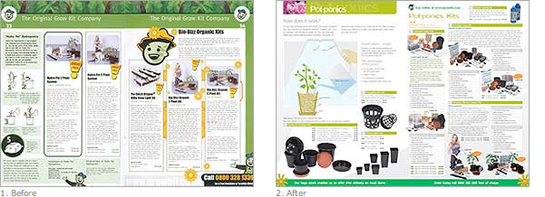
Before: first of all, the design wastes 20% of every page of the catalogue. The design is dated, and has too much green and black. The copy is in big, undifferentiated chunks, and is technically-led rather than benefit led. It's written for anoraks not amateurs. The layout is un-involving and one-paced.
After: a much lighter, friendlier and more modern feel. We created simple yet technically accurate colour diagrams with short intro to show it's easy. The headings are in colour, and the copy is broken up into benefits and contents panels. We also include consistent order calls to action, service benefits and cross-selling. It's fun, not boring.
4. Blue Print Section
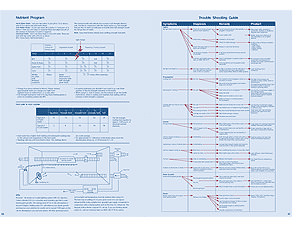
After: At first look, this is a cardinal sin. A waste of space - several pages of non-selling material. However, this section is part of the pages we added to the catalogue.
It powerfully differentiates GroWell from their competitors, showing they are about help and advice, and not just selling. It removes the fear factor, and encourages all readers to buy a bigger system. It's generated particularly positive feedback - a real loyalty-builder.
Whether right or wrong in textbook terms - it's proved an invaluable part of the marketing strategy.
5. Order Form
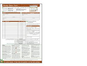
Before: well, what can I say? It wasn't even in the catalogue (this could be 'strike three', but I've lost count!).
After: needless to say, we've put it in the catalogue so it can't be lost, made it full colour, and placed it at the back, next to the hot spot inner back cover (where we resell some best-sellers).
6. Back Cover
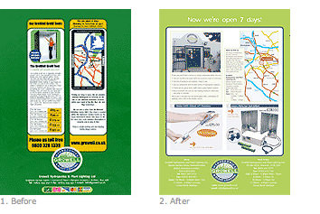
Before: a bit of a waste of the best-selling page - apart from one featured product.
After: we've put in a strong headline and more products - low-priced starter kits. (80% vs 15% of page utilised for selling.)
Other
Pagination: we revised the product order into a more logical sequence. Importantly, we promoted the kits from the back to the front of the catalogue. These are critical for new customers because they are a simple 'directed-choice' way of getting started.
Corporate identity: we also took the opportunity of updating the letterhead. We always like to review, and if necessary produce corporate creative guidelines.
These make sure that company positioning stays consistent across all media. You never know where a potential new customer is going to stumble across you - so it's vital that all these 'moments of truth' give the right initial impression.
The Results
The key objectives were met and surpassed. New customers were attracted without alienating long-term, core customers.
Finally, because I know some of you don't feel that making a catalogue look nicer is enough – turnover in each of the first two months after the catalogue was mailed out was over 40% up on the previous year. This represented a very positive ROI for GroWell.
It has even allowed their expansion plan to be brought forward. It just shows that redesigning your catalogue with a specialist agency can reap rewards across the business board.

